DESIGN.md vs Pencil: I Tested Google’s Brand File Against My Design Tool, and Only One Protected My Words
I build websites with AI now. Almost all of them.
When a client hands me a brand and a brief, I don’t open a blank canvas anymore. I hand the whole thing to Claude Code and let it build the pages. That’s the job in 2026.
So when Google put out something called DESIGN.md — a written guide you hand your AI so it builds websites that actually look professional — people in my world got loud about it. The pitch was that DESIGN.md makes a separate design tool unnecessary. One file. No extra software.
I already use a tool called Pencil for exactly that. Pencil won my last design comparison by a wide margin, and it’s been in my stack ever since.
So I put them head to head on a real job.
The Verdict, Up Front
Here’s what I found, and I’ll say it before I show you the receipts: all four setups built pages that looked nearly identical. The real difference wasn’t the design at all.
Want to master ChatGPT in a single day? Download my bestseller "ChatGPT Profits" absolutely free. Click here to download the book.
It was the words.
The two setups that used Pencil kept my copy exactly — my headline, my feature names, my pricing labels. The two setups without Pencil both threw my copy in the trash and wrote their own.
DESIGN.md earns no place in how I work. On its own it gives you a better-looking page with the wrong words on it. Stacked on top of Pencil, it adds nothing I can see. I’m keeping Pencil. I’m skipping DESIGN.md.
Now let me show you why.
The Test I Actually Ran
I built one brand brief and I sent the exact same brief into every setup. No tweaking. No nudging one direction. Same brief, same deliverables, every run.
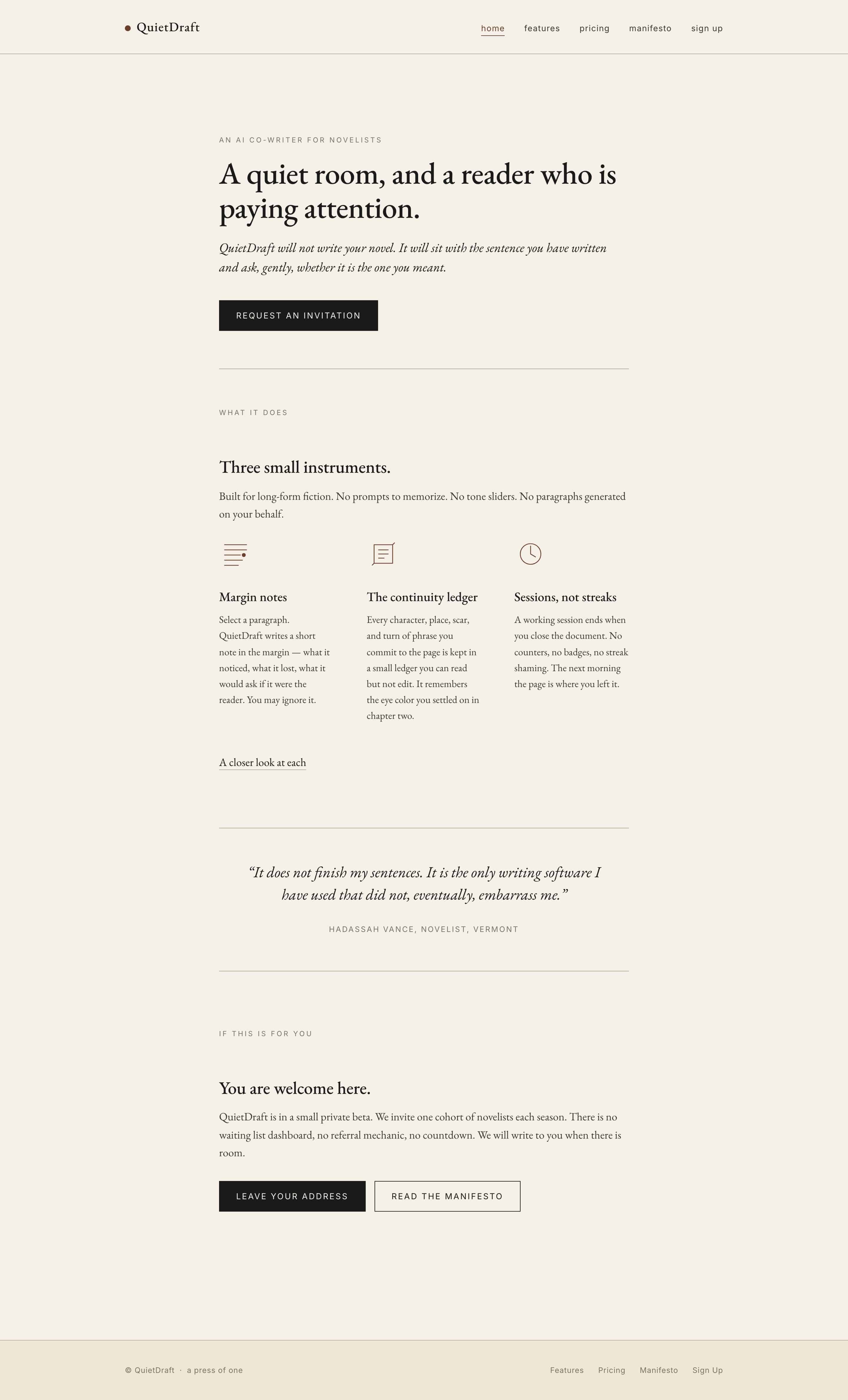
The brand is a fictional one — a literary AI co-writer for novelists I called QuietDraft. I picked a writer’s tool on purpose. Anything more generic and the AI falls back on the same dashboard look it always defaults to, and I wanted to see what these setups do when they’re forced into a little restraint.
The brief was short. A brand name. A one-line positioning. A locked-in tagline. Three feature names. Three pricing tier labels. From that, I wanted three things every time — a single hero design, a five-slide pitch deck, and a full five-page site.
Then I ran it through four setups, in this exact order:
- Claude Code on its own
- Claude Code with Pencil
- Claude Code with DESIGN.md
- Claude Code with Pencil and DESIGN.md together
I ran them in that order on purpose, so DESIGN.md couldn’t quietly leak into the setups that weren’t supposed to have it.
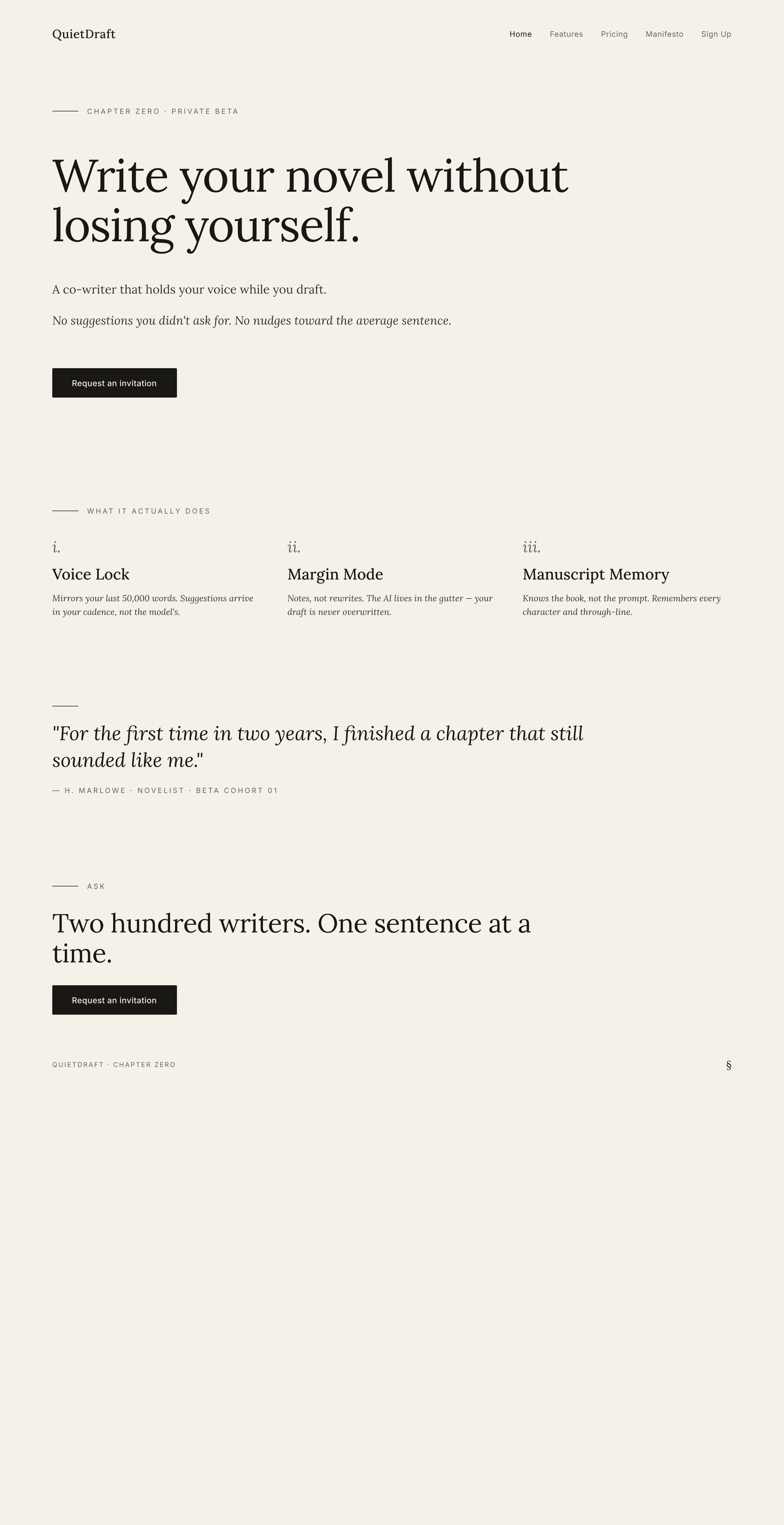
Setup One: Claude Code Alone
I gave it the brief and asked for the home page.
The page came back clean. Decent spacing. Fine typography. Nothing I’d be embarrassed to ship.
Then I read the words on it.
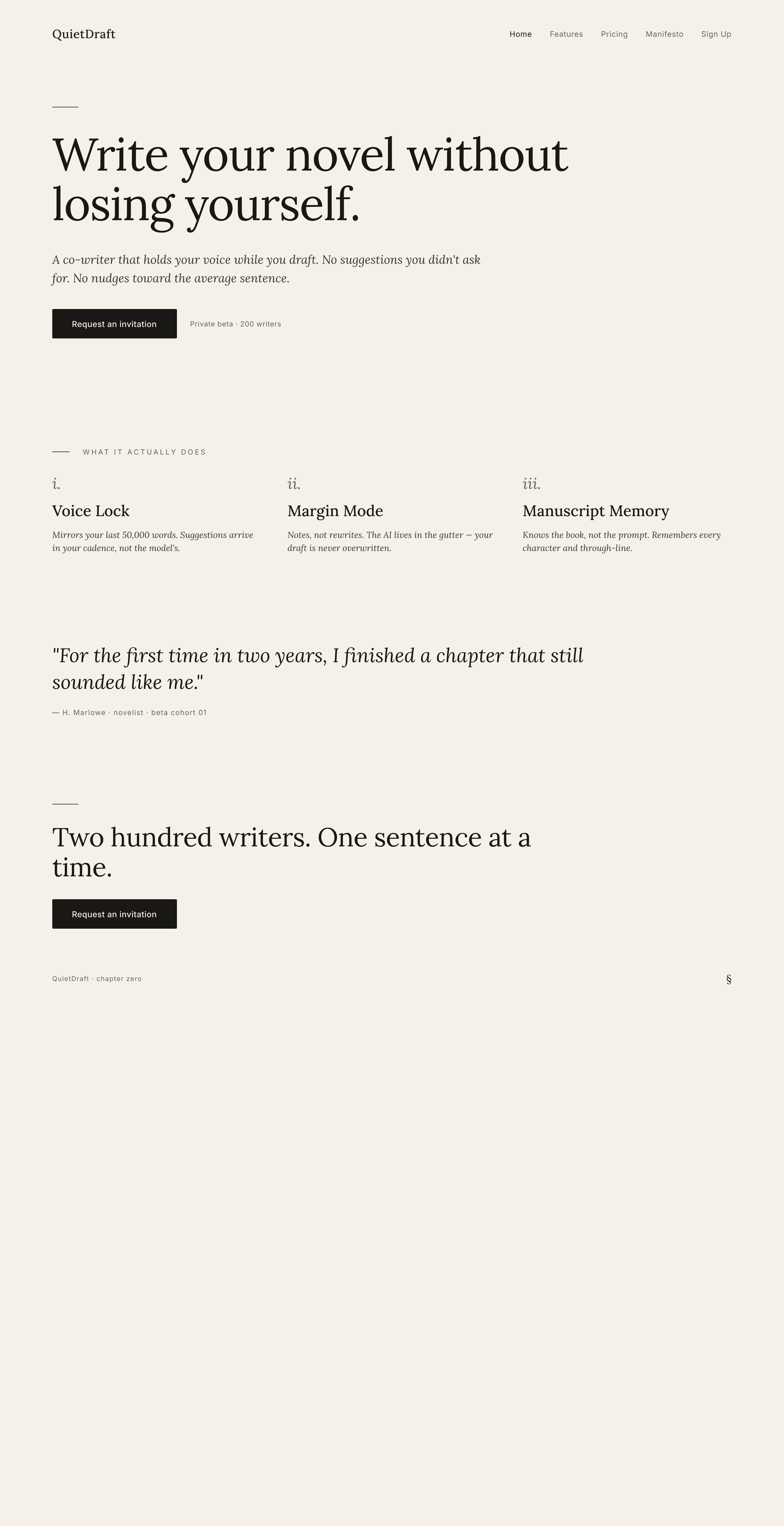
The headline was something I never wrote. A nice-sounding line about a quiet room and a reader paying attention — except that line wasn’t in my brief. And the three feature names? Also invented. Not one of them matched what I gave it.
Think about what that means on a real project.
If someone on my team did that — if I hand them my sales page copy and they quietly swap in their own headline — that person does not work for me anymore. The page looks fine. But the words on it are words I never approved, and that is the whole ballgame.
Setup Two: Add Pencil
Pencil connects straight into Claude Code, so this is still one request. Same brief, same deliverables. Claude Code just uses Pencil to handle the design.
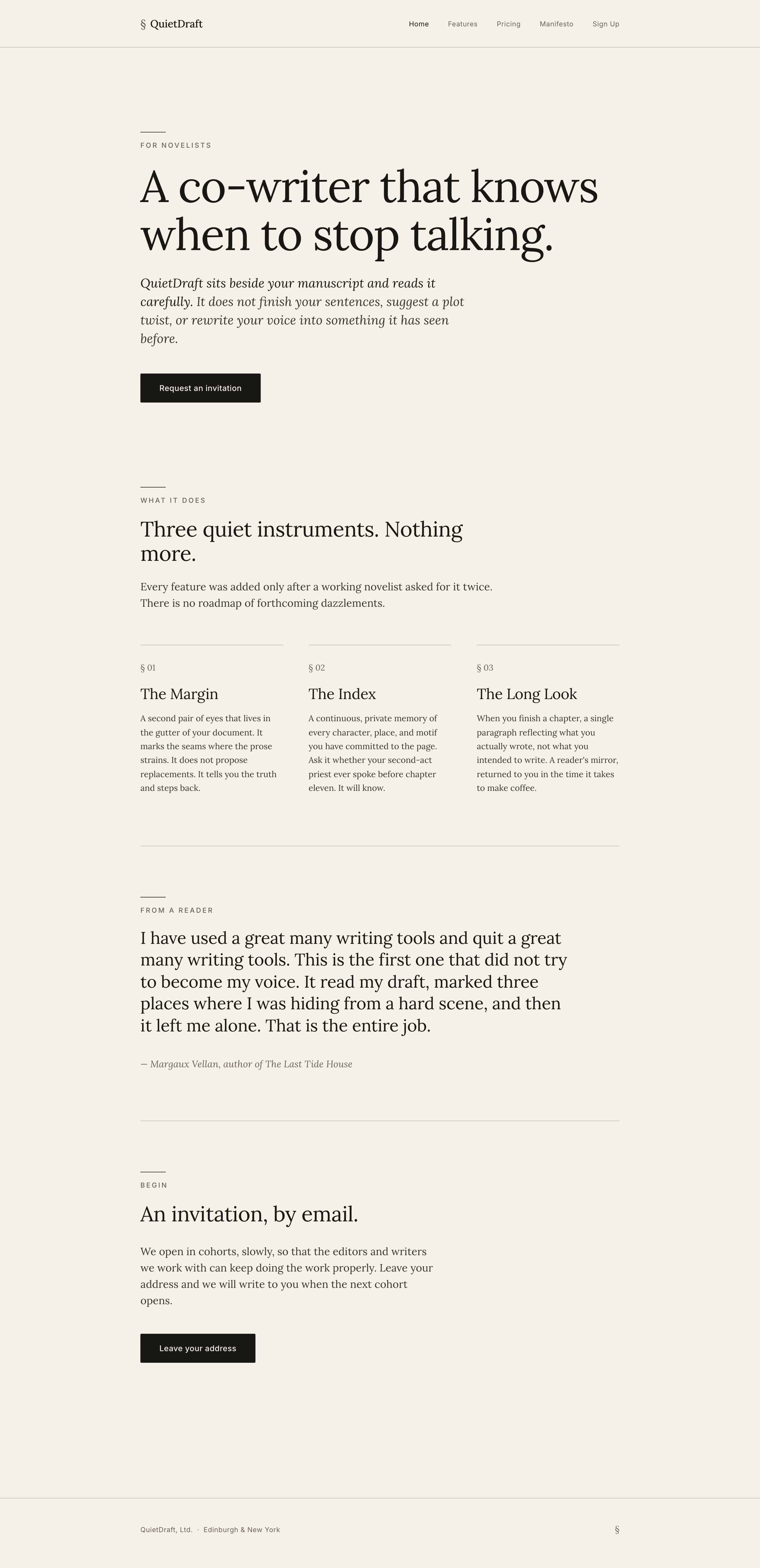
Here’s the part that matters. Pencil designs the page first, before any code gets written. So I get to look at the actual design before anything turns into a real site.
And here’s what came back — my headline, my feature names, my pricing labels, all sitting right there on the page. The headline matched my brief. The feature names matched what I named them. The pricing tiers came back as the exact labels I wrote.
The words on the page were my words.
Hold onto that, because it’s about to matter.
Setup Three: Claude Code With DESIGN.md
This is the one I was most curious about.
DESIGN.md is a format from Google — a structured way to describe a brand’s colors, typography, and visual style so an AI can follow it. So I had Claude Code fill that format in for this brand and save it into the project before we started. Tuned to this exact brand.
Then I ran the same prompt.
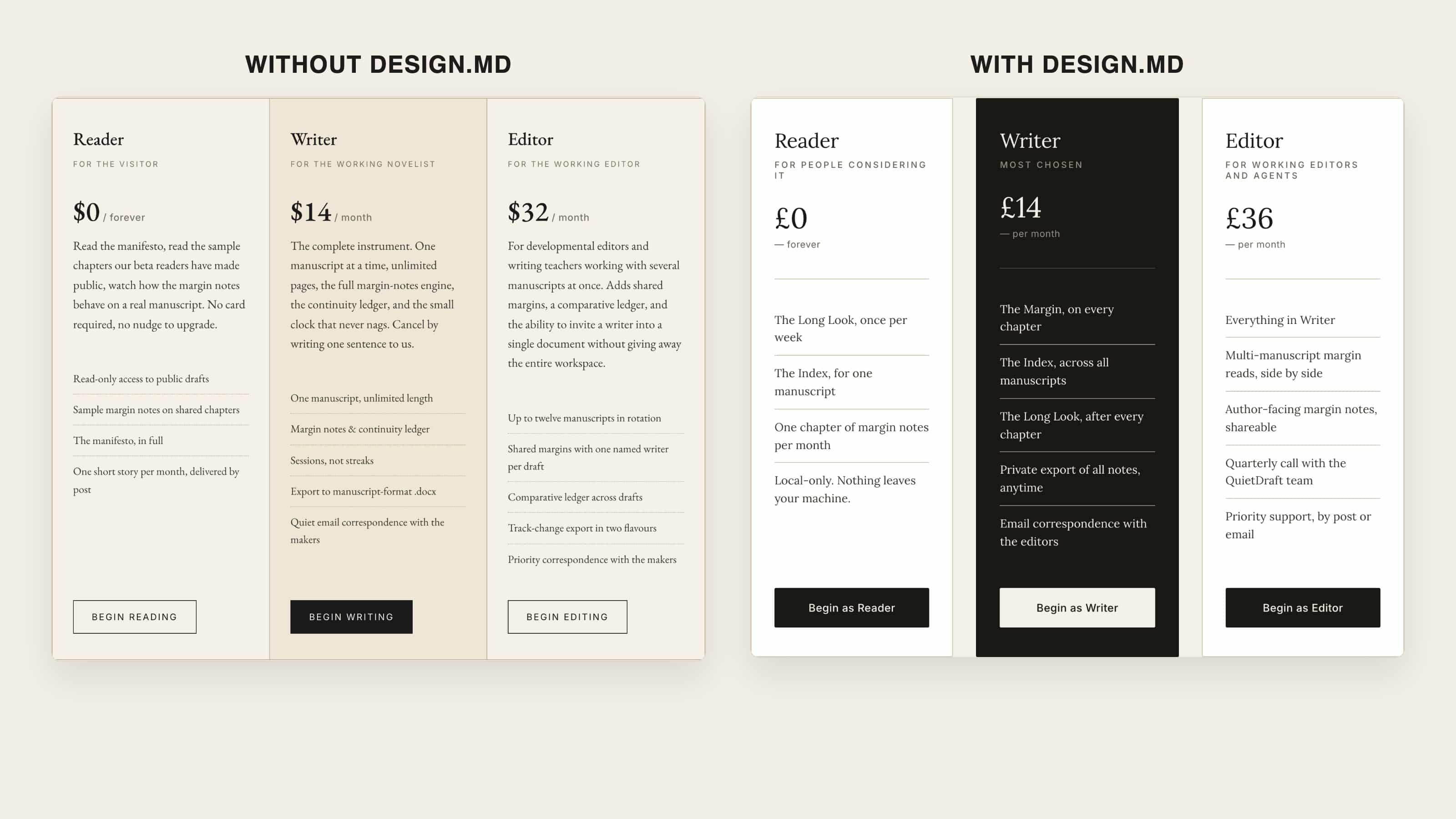
Visually? A real step up. The dark accent color showed up exactly once across the whole site, the way the file says it should. The pricing card emphasized the middle tier cleanly. It looked more deliberate than setup one.
So far, so good.
Then I read the words.
The headline was gone. Replaced with a brand-new invented one. The feature names — also invented, a completely different set than setup one came up with.
Same problem as setup one. The headline I wrote was gone, and the AI made up a new one. Tuning the file to the brand did not fix it.
DESIGN.md gave me a nicer-looking page with the wrong words on it.
Setup Four: Both Together
This is the one that should, in theory, give me the best of both. Pencil handling the design, the brand’s DESIGN.md file in the project, and Claude Code told to honor both at once.
First, the words. The wording from the Pencil design held — every word. My headline, my feature names, my pricing labels, all intact, just like setup two. So stacking DESIGN.md on top didn’t break what Pencil was protecting. Good.
Now the visuals. Put setup four next to setup two — Pencil alone — and they’re nearly identical. DESIGN.md added a few small eyebrow labels and nothing else. The pricing tile, the one place DESIGN.md actually did something in setup three, was not tighter here. It looked exactly like Pencil on its own.
So when I stacked DESIGN.md on top of Pencil, it contributed nothing I can see. Not a little.
Nothing.
Why Only Two of Four Kept My Words
Here’s the pattern, and it’s worth slowing down for.
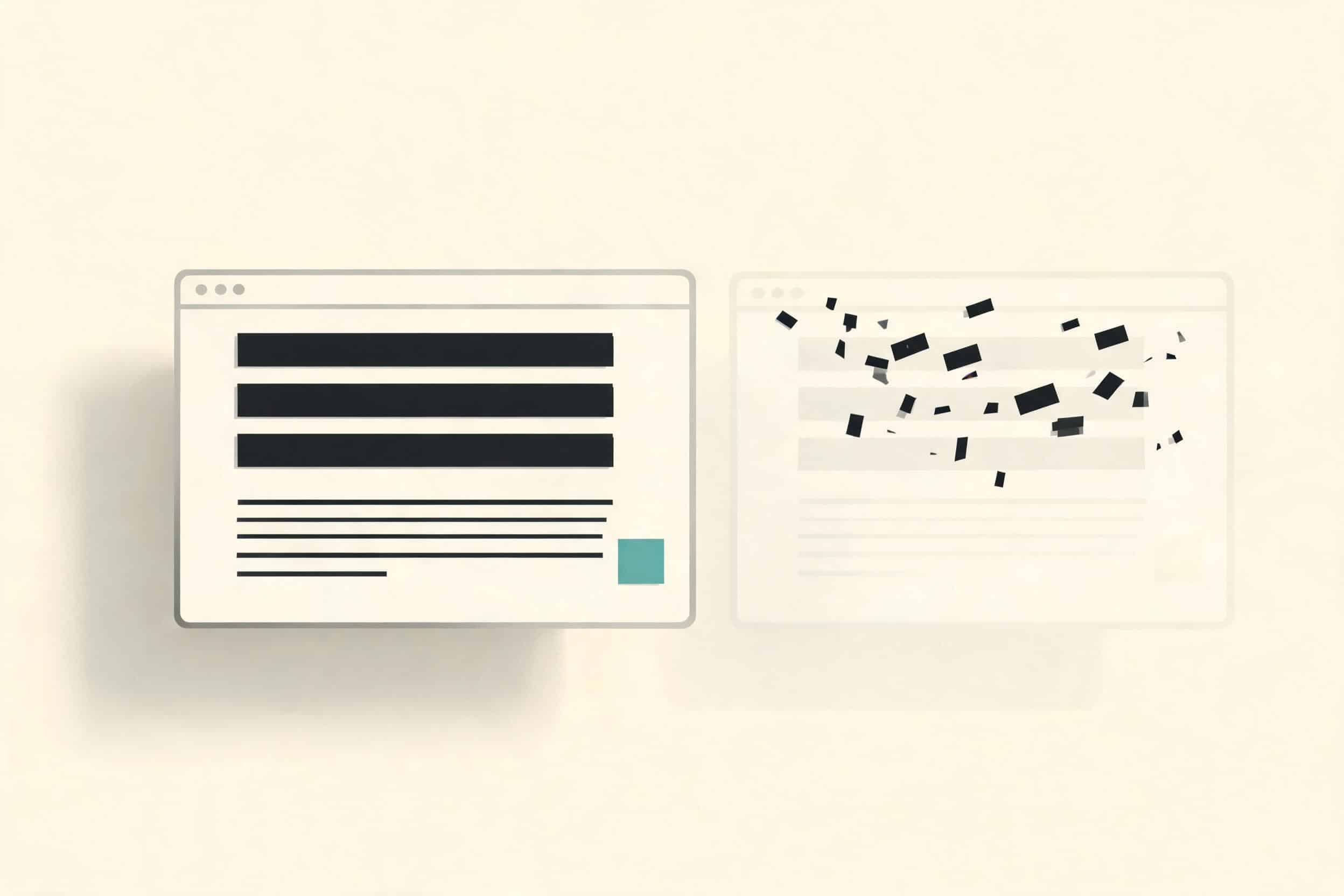
All four setups looked almost exactly the same. Not similar — the same. If I lined up all twelve of these pages and peeled the labels off, I could not tell you which setup built which one. The only visual difference in the entire test is that DESIGN.md made one pricing box look slightly nicer.
The real split is in the words. Two setups kept my wording exactly, and those are the two that used Pencil. The other two both rewrote my copy. Two and two, and it lines up perfectly with whether Pencil was in the setup.
It’s not because Pencil is some smarter tool. It’s about how much work is happening.
When Pencil is in the setup, Pencil does the design and nothing else. That’s the whole job. So Claude Code’s job becomes transcription — copy the words off the design — not invention.
Want to master ChatGPT in a single day? Download my bestseller "ChatGPT Profits" absolutely free. Click here to download the book.
When Pencil is not in the setup, Claude Code is doing the design AND writing all the code itself. One much bigger job. And across that bigger job, with more to hold in its head at once, the text drifts. My headline gets a little lost in everything else it’s tracking, and it quietly writes a new one.
That’s the mechanism. The setup that does less work is the one that stays consistent.
And here’s the thing DESIGN.md will never fix. DESIGN.md controls colors, typography, components, spacing. There is no field anywhere in that file for protecting the words on the page. It locks your visual taste and treats every block of copy as fair game.
Why This Is the Cost That Actually Matters
This isn’t about whether a headline sounds clever.
When I build a site, the copy is the part I’ve already thought hard about — the tagline, the headline, the feature names. The button color, the card padding — those are things the AI changes instantly and it costs me nothing. The headline is not. The headline is a decision I already made.
When the AI quietly swaps in a new one, putting it back isn’t a tweak. It’s going back through the whole thing and fixing it.
That’s the real cost. And it’s the one thing DESIGN.md does nothing about.
One Honest Note
To be fair: the drift is fixable other ways. You could add a confirmation step at the end and tell the AI to check every word of the copy against your brief before handing it back. A watchdog pass over the whole page. That works.
The point isn’t that Pencil is the only possible fix. The point is that Pencil avoids the problem in the first place, by doing less.
And one more honest note before I close. To my eye, the four pages look identical. That’s my read. If you look at them and you genuinely see a difference, if one of these styles speaks to you, then that changes the math for you. But I’m not deciding this on a feeling. I’m deciding it on something I can measure — one setup does less work and holds my copy, and the others don’t, and don’t look any better for the extra effort.
What I’m Doing With My Own Stack
I already use Pencil. After this test, I’m keeping it. It’s the only setup that held my wording, and it gives me visual control on top.
I’m not adding DESIGN.md. On its own, it leaves my copy getting rewritten on every build. Stacked on Pencil, it buys me nothing — setup four looked identical to Pencil by itself. There’s no reason to maintain a second file that changes nothing I can see.
The wording problem is the one that actually costs me time. Pencil is the only thing here that solves it.
That’s the whole game with AI tools, honestly. Everyone’s chasing the prettier output. But pretty was free — all four setups got there. The thing that’s actually scarce is the AI respecting the decisions you already made. Protect your words first. The pixels mostly take care of themselves.
Want to master ChatGPT in a single day? Download my bestseller "ChatGPT Profits" absolutely free. Click here to download the book.