I Tested 5 AI Design Tools On The Same Brief
I spent last weekend running the same exact brief through five AI design tools.
Claude Design. Pencil. Huashu. OpenDesign. Paper Design.
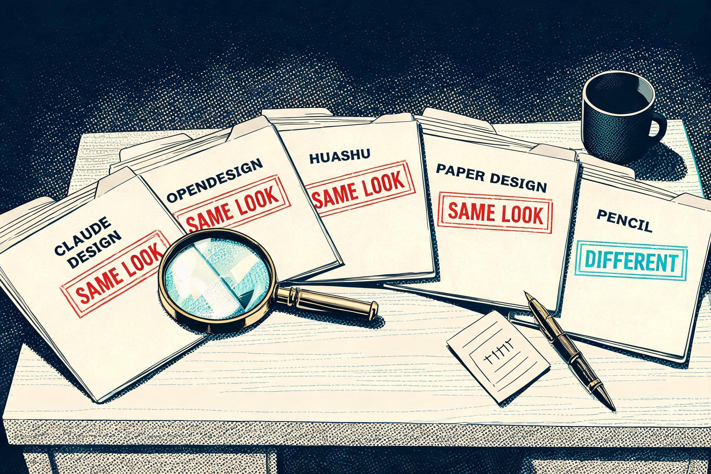
I expected variety. I got the same fonts, the same colors, the same vibe across four of those five tools. Different login screens, same answer.
Only one of the five produced something visibly different. One tool out of five with an actual point of view.
I am annoyed. I expected to wow you with meaningfully different designs from a category that has launched five “alternatives” in the last quarter. What I got was four of the five converging on the exact same default and a fifth one quietly doing its own thing.
This post is the verdict on which tool actually deserves your tokens, why the rest of the field looks identical, and the workflow split that is the only real difference between these tools.
Want to master ChatGPT in a single day? Download my bestseller "ChatGPT Profits" absolutely free. Click here to download the book.
How I Ran The Test
I built a fake brand called QuietDraft. A fictional AI co-writer for novelists, anti-hype literary brand voice.
I picked a novelist tool on purpose. Anything else would let the AI default to dashboard UI — and dashboard UI is where these tools all look the same regardless. I wanted to see what each one actually does when it is forced into restraint. A literary product is restraint by definition.
Three deliverables per tool. A hero. A five-slide investor deck. A five-page marketing site.
Same exact prompt text into every single tool. No tweaking per tool. No nudging one direction over another. The variance is the data.
For every tool I tested, I started fresh. A brand new project for the hero. Another brand new project for the deck. Another brand new project for the site. Three completely separate sessions per tool. Three fresh starts for each of the five tools. Fifteen separate generation runs in total.
Then I lined the outputs up side by side and looked.
Four Of The Five Returned The Same Design
Same default font. Same cream paper background. Same single accent color. Different login screens, same answer.
Claude Design did it. OpenDesign did it. Huashu did it. Paper Design did it.
Same recipe, four different brand names.

Read the grid left to right. The proprietary tool, then the open alternatives that have product pages claiming to be different. Same serif headline. Same restrained body type. Same warm cream paper. Same single-accent-color discipline. The login screens at the top of each output are the only thing that tells you which tool produced which column.
Pencil is the one that breaks the pattern. Different headline shape. Different color logic. A real visual identity at the page level instead of a template feeling.
The reader scrolling LinkedIn sees five different brand names and five different install pages. The reader who actually uses all five sees the same recipe behind four of those brand names.
The marketing categories on a product page are not the same as the production categories you discover after testing. This is the same pattern that shows up evaluating any AI tool by reading its features list instead of running it across three deliverables.
The Tool That Prints Its Own Recipe
The proprietary tool was the most obvious about it.
Its HTML output includes a chrome banner at the top of every page describing the design system it just used. Same default font, same cream paper background, same single accent color — the tool literally writing its recipe at the top of its own work.
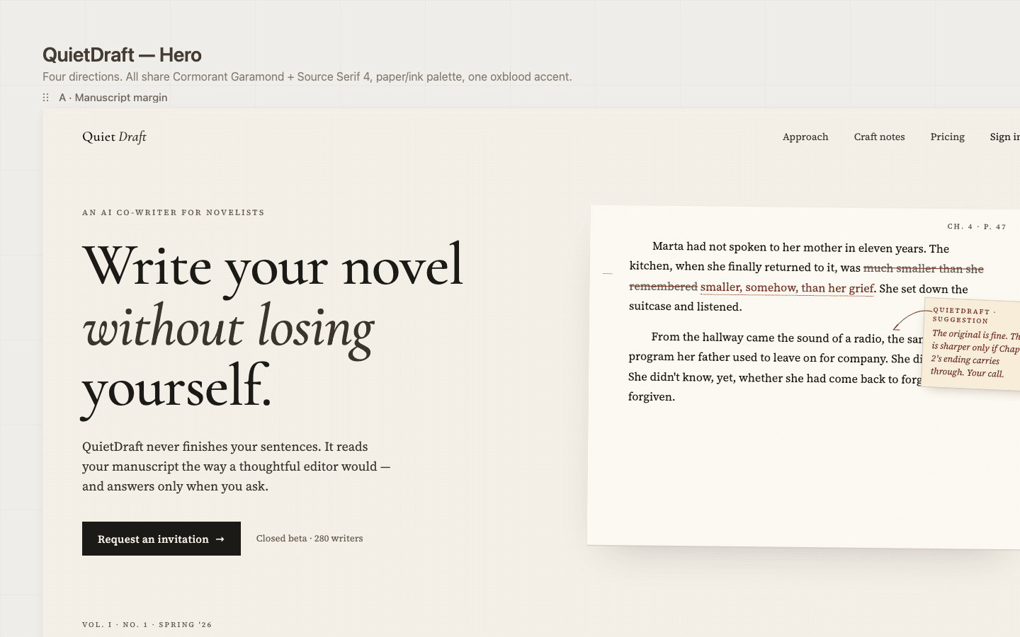
It is one thing to discover the pattern by lining up four columns and seeing the same answer. It is another to have one of them announce the recipe in plain English at the top of the page it just generated. The tool is telling you, on the output itself, that it has one direction and produces variations of that direction.
The other three matching tools are quieter about it. The behavior is the same.
The Workflow Split That Actually Decides It
The real difference between these tools is not what they produce.
It is when they spend your tokens.
Pencil draws the design first. You look at the design. Then, if you want code, you ask for code. The design phase is cheap because Pencil is drawing inside its own design surface — not running an HTML build in the background. You see the design before you commit to anything heavier. Reject it, iterate, refine, all for the cost of redrawing on a canvas. The HTML build only happens after you have already approved the direction.
Claude Design and OpenDesign run in the opposite order. They generate HTML in the background as the first step. By the time the output renders for you to look at, you have already burned tokens on a multi-file build you did not yet know if you wanted. If you do not like the direction, you discard work that already cost real money.
This is the entire game.
On the largest Max plan, Claude Design burned three percent of the weekly limit on two prompts. Two prompts. The largest tier of the plan. Anything smaller and that percentage is brutal — you will hit your weekly cap on a single client project, not a single week of agency work.
Then I tried to export the hero HTML as an image. The tool could not do it.
It tried to render a screenshot NINE times. NINE separate attempts, burning through tokens at an alarming rate. I finally gave up. I had to spend more tokens to get a downloadable HTML file out of the tool, then convert that HTML to an image myself with a separate tool.
That is the actual cost of an HTML-first workflow when the export pipeline cannot finish. You pay for the design build. You pay for the failed renders. You pay for the recovery. And you still do not have a finished image.
A design-first tool charges you once for the design. If you like it, you commit to the HTML. If you do not, you redraw. There is no scenario where you pay for a build and then pay again to convert it to a deliverable the tool cannot produce on its own.
OpenDesign Has One Use Case
OpenDesign earns exactly one slot. The situation where you want to use an AI model from outside the Anthropic Claude family that does not support MCPs.
OpenDesign supports multiple model backends. That is the one feature it ships that the other tools in this field do not. If you are running an agent that is not Anthropic Claude and that agent does not work with Pencil, OpenDesign is the only entry built for that.
Otherwise, OpenDesign is more friction than Claude Design with the same output direction at the end of it.
Before it will generate anything, it asks you a battery of multiple-choice questions. Tone. Style. Direction. Industry. By the time you are done answering, you have done more decision-making than the tool will do for you. It cannot just take a design brief and run with it. It was the most annoying tool of this entire bunch.
The output ends up in the same place Claude Design lands. Same recipe, different intake form.
What I Am Running Going Forward
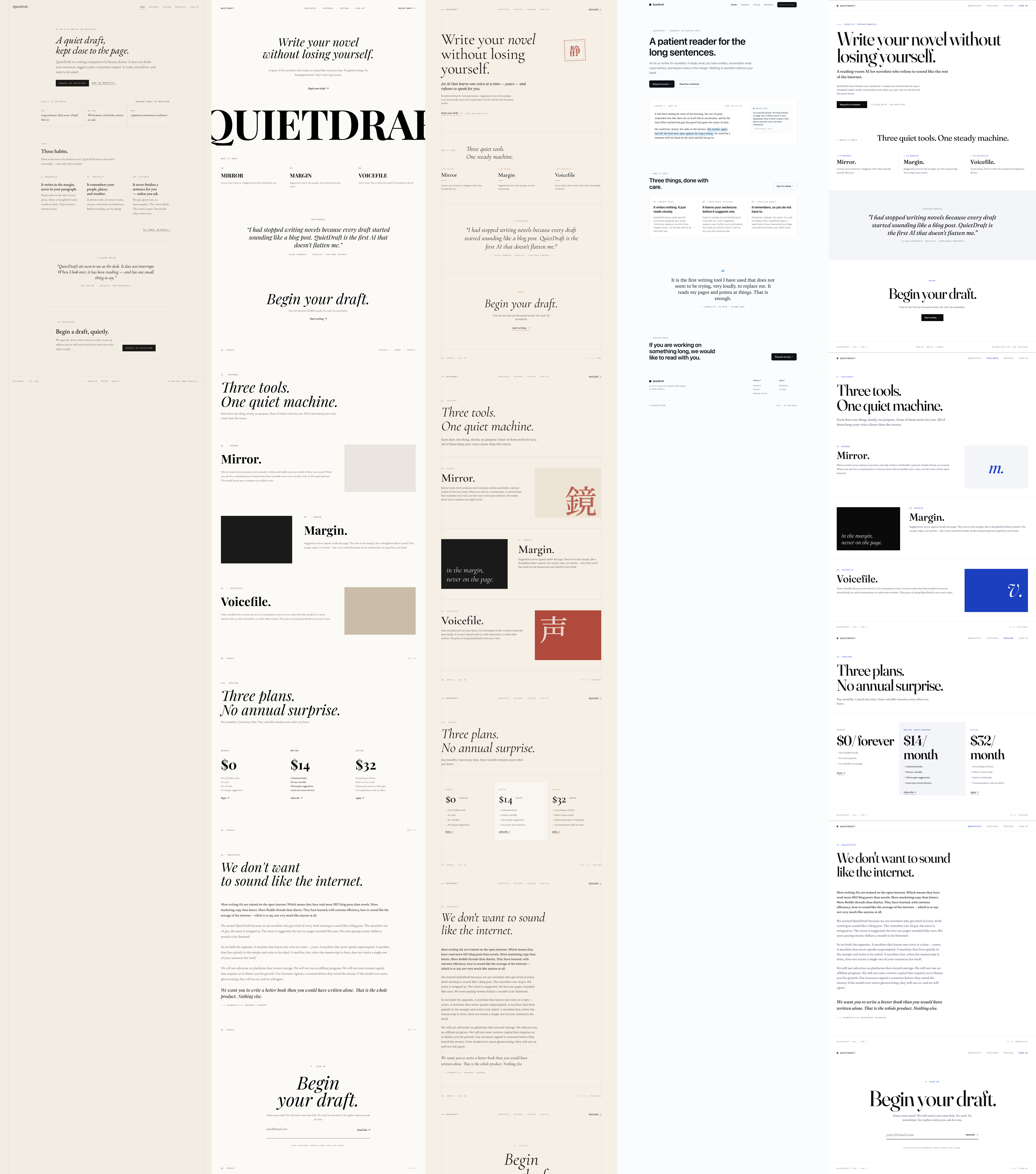
Look at the five website outputs at once. Four columns share the same recipe — same fonts, same paper, same single accent treatment, same visual restraint. The fifth column ships a visibly different direction. The grid is the verdict in one image, and I trust your eye to confirm it without my commentary.
Pencil is what I use, and this round of testing did not change that. The output is the only one in the field with a different point of view. The design-first workflow keeps the cost of rejecting a direction near zero. It drops into Claude Code as a real MCP with no separate billing. You install it once. There is no second subscription on top of the one you already have.
I am not blindly defending it. Pencil pushed an update in the middle of this test that broke a couple of my early renders, and that wasted real tokens. The tool is not perfect. But the architecture is right, and the team is shipping, and an imperfect tool with the right architecture beats a polished tool with the wrong one every single time.
Huashu and Paper Design are real MCPs and they finish the job, but they don’t produce output meaningfully different from Claude Design. If you are already happy with one of those, fine. They don’t earn a switch. They earn a place on the shortlist of MCPs that work, which is a smaller list than the marketing makes it look.
Claude Design fits exactly one slot for me. A one-page PDF or a quick rough draft. Anything more than a one-pager and you are paying for trash. I am never using it for anything except a quick rough draft.
Watch The Test On Camera
The video shows the actual export bug landing in real time — the NINE screenshot render attempts before I gave up. You can watch the token meter move while it fails.
What This Actually Means
The output across this whole category is a race to the bottom. Every tool is converging on the same recipe. Pick the one whose workflow matches how you actually want to work, because that is the only difference that actually matters. They all end up looking the same anyway.
If you are on Claude Code, use Pencil. If you want a non-MCP option, use OpenDesign and accept the friction.
Want to master ChatGPT in a single day? Download my bestseller "ChatGPT Profits" absolutely free. Click here to download the book.
Maybe I messed up my tests. Maybe one of these tools gives you better results than it gave me. Maybe I should have tested the new Google Design.md as a sixth entry — that one is on my list.
Either way, you test before you trust. The marketing pitch on a product page is not the test. Three deliverables on three fresh starts is the test.
Want to master ChatGPT in a single day? Download my bestseller "ChatGPT Profits" absolutely free. Click here to download the book.

