How to Design a Beautiful Blog Logo
In the past, designing a logo was a nightmare. You had to try to draw something yourself or hire a designer who can never quite get your vision into reality. For a brand new business, spending hundreds or even thousands of dollars on a logo might not be the right decision.
There is a very good chance you’ll want to change your logo a year from now. I have changed the Serve No Master logo on this site at least four times so far. It’s really hard to change your logo when you invest a lot of money. You end up keeping that logo even if you don’t like it.
In this post, I’ll share the shortest path to a logo that gets you excited, costs next to nothing, and comes with unlimited revisions. I’m going to show you a couple of AI image generators that have made logo design easy again.
What Color for Your Logo
If you haven’t figured out a color scheme for your website, Coolors has an amazing color generator tool. There are five colors in your palatte. Each time you hit the space bar, the colors all change. They are always colors that work with each other, so there is no risk of choosing colors that accidentally clash.
When you find a color you like, hit the little lock icon and that color will stop spinning. Each color includes an official name and a hexadecimal code. These are very precise way to describe a color, bu it’s necessary. There are 256³ or 16,777,216 colour combination available using HEX codes. Without an exact number, you will lose something when you start creating your designs.
Once you have your colors locked in, we can start creating our logo.
Want to get more blog subscribers and build your fan base? Download my free guide "Get Your First 100 Fans" Click here to get the guide.
Logo Image with MidJourney
You don’t need all five of your colors to appear in your logo. At most you want three colors. Usually, I end up with a logo that uses just 1-2 colors. After I have my image, I’ll worry about the text component.
The beaty of Midjourney is that you can re-run the exact same prompt as many times as you like to get different results. This is called re-rolling. Unlike working with a human designer, you get unlimited re-rolls or revisions of your designs.
We want to start with a prompt, which is simply the name for a command to an AI, that will give us a logo every time.
A vector logo for a [WEBSITE DESCRIPTION] called [WEBSITE NAME], [COLOR NAMES], flat, white background
This is a very simple structure that results in a logo every single time. If I want a 3D style logo, I’ll replace flat with the word 3D. I want a white background so that I can easily remove the background to use on my website.
Not every logo I design has a pre-planned color, so I often leave that section blank. This allows MidJourney to be completely free and come up with something I never expected.
Let me show you some examples. My membeship area is called RoninSchool. Here is the prompt I used for my new logo:
a minimal blue vector logo design for an website that teaches online business called with a ronin samurai theme, flat, white background

This logo looks great other than the strange letters beneath the image. I removed these letters and added my own to the right of the image to get my current logo.

This is a very simple logo that mainly uses the blue from my color scheme. In less than ten minutes, I created a workable logo using a very simple prompt. While the original font looks Amazing, it is beyond my ability to replicate. Rathr than worry about that, I accept this logo as good enough and keep moving forward.
For my next logo, I want something more colorful. This design is for my new coloring book website, so I want a lot of vibrant colors that get people excited to color.
a vector logo design for an website that sells coloring books called Uncoloring, flat, white background


These are my first three rolls from this prompt. I left my desire pretty wide open. All MidJourney knows is the name of the site and that I sell coloring books. Anything can happen from here.
Each of these designs is exciting in its own way. I really like the lion and that got attention. I then wanted to make a dragon with this style. That would be my dream logo now that I’ve seen this amazing lion.
MidJourney can do more than just generate an image, it can also analyze an image. I downloaded the lion and then used the “describe” prompt to have MidJourney create a new custom prompt for me.
logo, a vector of stylized dragon head in rainbow coloring, in the style of flowing silhouettes, calligraphic lines, carved animal figures, translucent color, stenciled iconography, squiggly line style, psychological phenomena illustrations

This dragon embodies everything I want from a coloring book logo with a dragon in it. It’s what I wanted and I didn’t even know it until I saw it.
MidJourney is not just limited to 2D logos or a white background. You can create amazing 3D logos that capture your visitos imagination. What happens when we ask for a 2D logo of something that is inherently 3D?
pop-up book, vector logo, 2D


Each of these is absolutely magical when views up close, but from a distance…not so great for a logo. IT’s very hard to remove the background. Evne when asking for a white background, half the time you get a white moon or the book pages or white so it’s hard to separate. But you get a sense of what’s possible.
One of my clients wanted a lot with very specific colors and imagery. He was struggling to get a look that he would like. His mistake was starting with a very long prompt. When you know what you want, start with as little information as possible and slowly tweak the prompt until you love the result.
a round vector logo design of a children’s swingset next to a house, purple and green flat, white background

Here we have some hits and some misses. The bottom left image has the house on the swing instead of next to the swing. The other three logos, however, are exactly what he was looking for and he is very please with his new logo.
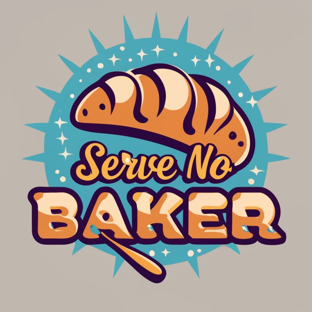
For my next project I want a logo for a baking blog that uses one of the colors from a specific color scheme. This color is called “Argentinian Blue.”
a round vector logo design for a baking blog, using the color Argentinian Blue, flat, white background
baking blog

cake

pie

Each time I run the same prompt, I get very different results. It’s a question of liking the text placement in the first batch or prefering a simple image of a cake in batch twoo or a pie in batch three.
I changed the word “baking blog” to “cake” and then to “pie” to get completely differnet logos. Often changing just one word dramatically shifts the output from MidJourney
The NEw Kid in Town – IdeoGram
There is a new image generator that can do image and text all at once. You have a little less control over what the image will look like, but there is a chance that the logo and text will all come out together. This site depends a lot on rerolling until you hit that magic design that you fall in love with. If you get a design that’s 90% of what you want, you can’t tweak the prompt to get to 95% on the next roll. You have to just roll again and hope for one you like a little more.
The advantage of Ideogram is that it can to text, which is a huge advantage. The disadvantage is that there a lot of luck involved in getting a logo you love.
vector logo design for a bakery called “Serve No Baker”, using the color Argentinian Blue, flat, white background
I want to keep it simple and just say bakery instead of baking blog. I care more about the text now. I’m going to roll several times before I look at any of the designs because I know quite a few will have spelling problems.


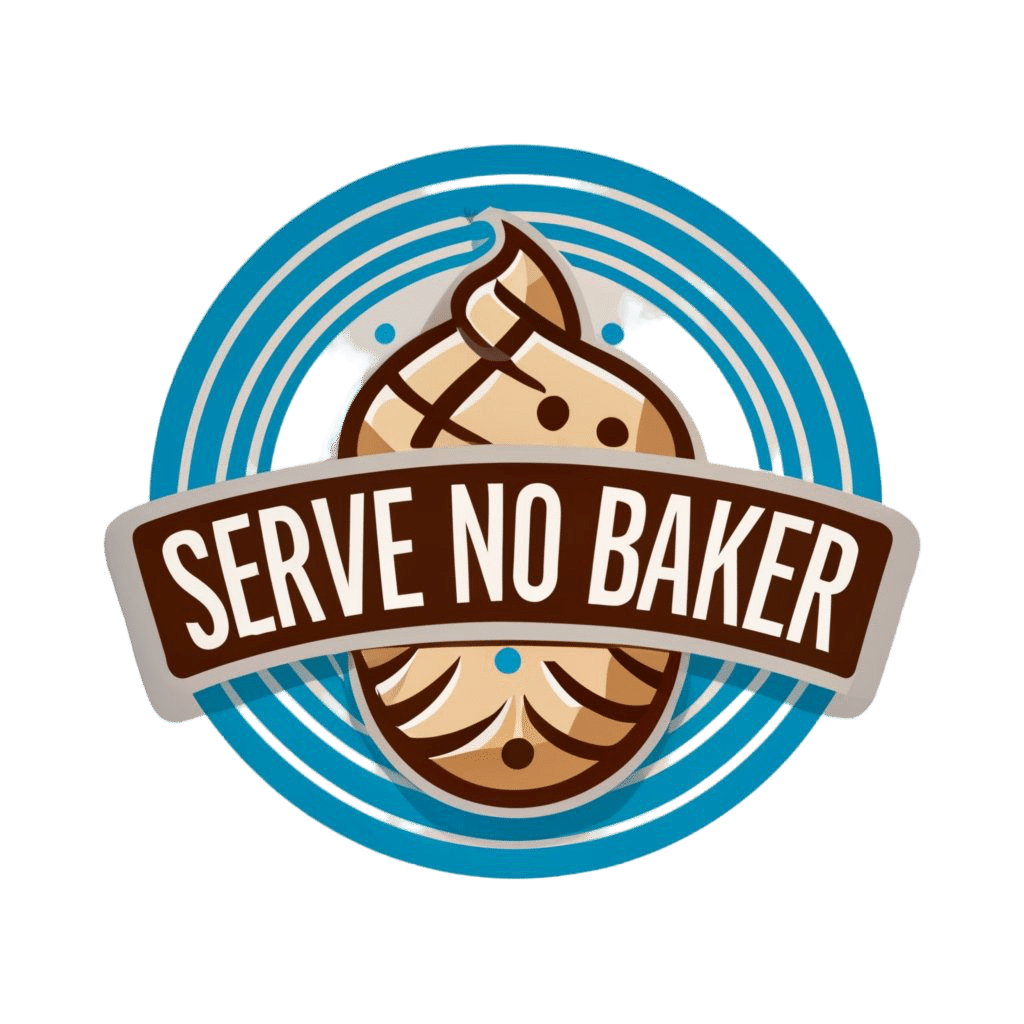
Each of these is close to a great logo but the whole point of using Ideogram is the letters. Each of these has misspelled a different word in a different way. You really never know what you’re going to get. Each of these is great but also wrong in a way that’s unfixable.
If I knew how to do the letters in a logo myself, I wouldn’t be here.
Sometimes the logos that Ideogram creates are close to usable but something about them is weird or slightly offputting. It’s really close to right but there is some little element that makes things weird.


If the process of creating a logo for your blog were normal, we could take each of these logos and turn it into something. These are all eighty percent of the way to a great logo. That’s why I’m sharing a larger collection. A misspelled logo is easy to reject, but some of these are really close.
I had to look at the cupcake logo a few time sto realize the problem is not that the work baker appears twice. It’s that the cupcake has three eyes. That’s a haunting image that’s hard to forget once you’ see it.
This is why we have to re-roll with Ideogram at least half a dozen times. So that there are some absolute winners in the batch.


Each of these logos is ready to go or something I believe I can fix with my ability to edit images. For most of these, I just need to remove some extraneous text and they are workable. From this batch there is one logo that’s redy to go without any editing needed. So I’ll use that in the next step.
REmove the backround
Not every website uses the same grey as a background. I often reverse the colors on a website, so that the background is black. This helps my eyes a great deal and limits the strain I put on them.
Clipdrop has a free background removal tool that can be found at https://servenomaster/clipdropremove
Want to get more blog subscribers and build your fan base? Download my free guide "Get Your First 100 Fans" Click here to get the guide.

There is an alternative at https://ServeNoMaster.com/removebg. Each of these tools removes the background in a few seconds. They use a different process so it can be worth testing both.
You can also remove backgrounds using Canva and other image editing tools like Luminar Neo, but these are all slower than just dropping the image into a specialist tool.

As you can see, the despite solving the same problem, the two background removal tools give vastly differnet results. If ther was a real AI overseeing the process, surely it would know to remove the frosting from either all of the blue circles or none of the blue circles.
This turned out to be tougher than I thought and both require a little manual removeal of colors in the circle lines. I’m going to use my second favorite logo intead.

This time Clipdrop had zero problems. The reason this is my second choice and not my first is the font for the word baker. I’m going to have to fix this in the next step.
Whether you use Ideogram or MidJourney to make your logo image, you need to add or cleanup the text a little bit. For this I’m going to use Canva. I am unable to do curvy text anywhere else.
Add Text to your Logo
While MidJourney can create amazing images, it’s not there with fonts yet. You need to add a font that you like to any image. With Ideogram, we need to tweak the font a little to get the final result we want.
I need to identify the font that’s already in my logo. I can manually go thorugh the thousands of fonts inside of Canva, but the the odds of me finding a match are about zero. I tried with this logo and literally skipped right past the correct font without realizing it.

Font Squirrel has a really good font detector tool. Called the Font Identifier. By cropping out an image of the text “Serve No” I can get Font Squirrel to tell me what font Ideogram used.

If you just have a MidJourney image, you can skip this step and go straight to testing fonts next to your logo.
Create a custom image in Canva that is the same size as your logo image.

When you add the image to Canva, it will always appear smaller than the canvas. Even though the image and the background are the same size, Canva defaults to showing your logo as smaller than the background.
Stretch the logo image to match the Canva canvas.

Remove the extra text with Magic Eraser. This is one of Canva’s best tools and will give us a canvas to add new text.


Canva has the font I’m looking for. I write the word BAKER in Bitter Bold and it looks pretty good. I then decided to remove the original text and put it above my muffin character. Using the Canva curve text tool, I get a pretty decent result and download it with a transparent background as a png file.

That’s the entire process. Canva is always adding new features and with their new AI, soon you’ll be able to edit the text without figuring our the font on your own. I’m excited for the future!
Convert Your Logo into a Vector
The next step is to use the vectorizer at https://servenomaster.com/vectorizer.
A vector is an image that is infinitely scalable. No matter how big or small you make the image, it will not pixelate and go out of focus. This is a special image file type.

In the past, you had to manually convert and image into a vector and this could easily take hours. Now we have an aI tool that does it in a matter of seconds.
If you’re not happy with the vector, you can edit it. I haven’t needed to make any changes yet, but you can edit the vector if anything isn’t how you want it.
When you’re happy with the vector you can download it.
Please download with these settings. Just copy my settings and you’ll get a great result.

Now I want to test that my vector is working. Here you can see the vector tiny on a huge background and zoomed in to almost 10x better. It looks crystal clear at both sizes.


I can’t upload an actual SVG file to WordPress as an image. My images get automatically reformatted to WEBP anyways, so you won’t be able to tell. I just have to promise you that this worked. You can test your own vectors by zooming in and out to make sure the result looks great.
WARNING: Not All Vectors are Created Equal
Sometimes Vectorizer creates artifacting. Here are two examples of a shirt I was working on with the words “Let’s Glow Crazy.” This is a really complex image that is hard to break into smaller shapes.

As you can see, the image on the right actually looks fuzzy. Turning it into a vector has pushed the image out of focus. This is the limit of what vectors can do and I wanted to show you that there is a limit. Vectorizing isn’t always the solution.

You might need to zoom in or get closer to the screen to see the difference, but the vectorized image looks worse than the original image. Images with a lot of texture such as fuzz or feathers are beyond this tools’s ability.
When you have an image that can’t be turned into a vector, just upscale your image using an AI rather than creating a vector. The best tool for this is https://servenomaster.com/gigapixel. This is one of the most important tools in my arsenal and I use it every single day.
There are free image upscalers but all of them have left me disappointed with their results compared to Gigapixel.
Congratulations on Your New Blog Logo
You’ve done it! All the heavy lifting with some really cool AI tools.
It no longer takes weeks or even days to get a killer logo. It’s just a matter of minutes. Please share your new creations in the comments below!
Want to get more blog subscribers and build your fan base? Download my free guide "Get Your First 100 Fans" Click here to get the guide.